
Wait for the Punchline…
A line chart allows the visual representation of data in the form of points connected to form a line. Whether it’s straight or curved will depend on the data being used to create a line chart. Line graphs are the simplest tools used to represent quantitative data variables.
What’s on the Line--Variations
Simple or not, don’t mistake line chart examples as being basic! They come in different varieties, and each is better suited to present certain kinds of data. Here’s a few examples:
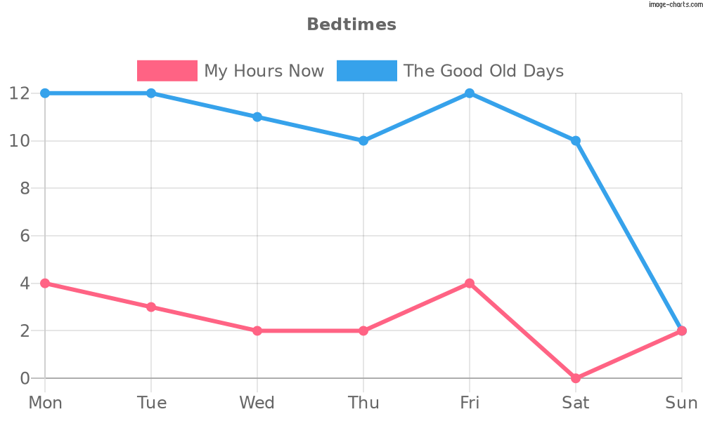
Simple Line (Basic)

As evident from the chart above, simple line graphs only comprise one line that shows how two variables are related. In this case, the days of the week and when I went to bed in the morning. The name should clue you in this is the simplest and most classic example of line charts.
Stepped
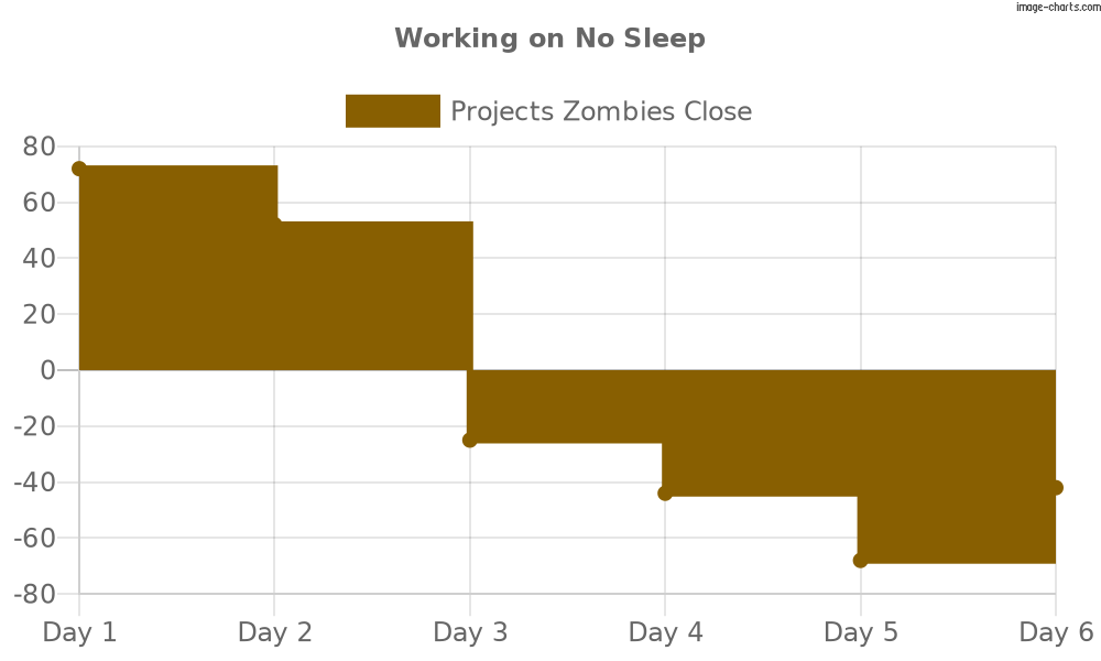
Line charts where vertical and horizontal line segments connect the points are called step line charts. Unsurprisingly, the resulting pattern resembles a staircase or steps. The width of each step is equal to the value of the independent variable–days, in the chart above. The step direction, on the other hand, has three different modes:
- Default or center mode in which the data points are at the center of the horizontal segments.
- Forward mode in which the data points start where the horizontal segments begin.
- Backward mode in which the data points are present at the tail of horizontal segments.
Compound Line (Multi-Axis)
After working out how to make a line chart for simple data sets, let’s see the chart type you can use to present complicated data:
A simple line chart expands into a compound line when you use it to showcase data subdivided into types. Therefore, compound line charts are good for presenting multiple data sets but in one chart.
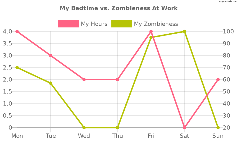
The second type of compound line’s a multi-axis chart. That’s because it displays two sets of variables–hours of sleep and zombieness levels–but for the same independent variable, i.e., day of the week.
Sparklines

A sparkline’s what you get when you reduce a common line graph to its core components. Usually, there aren’t any axes on these tiny graphs, and they emphasize the change of value. Have multiple data sets but with a single set of axes? Stack small sparklines vertically on a page to draw eyes to the focal point, i.e., the pattern emerging from the changing values.
In the Pipeline—Use Cases
So, now you know what is a line chart and its different types. Let’s discuss their uses. Line charts are in use for data visualization across industries. They’re easy to interpret and simple to plot. Below are a few use cases of these charts:
- Real Estate - Potential homeowners can use line charts to track seasonality in the real estate market. Some might want to know how an ongoing recession is affecting the availability of homes, while others could plot to determine the best time to buy/sell houses.
- Stock Market - More buying and selling to be done and more line charts in support or against the decision. So, you can follow the changing values of a particular stock or predict up/downward patterns with a trend line chart.
- Banks/Finance - Line charts can demonstrate everything from the number of borrowers per month and over the years to how well a company’s stock is doing.
- R&D - Scientists often present the results of experimentation by plotting them on line charts. The analysis of said charts can indicate the direction for their next batch of experiments.
The Lineup—Most Common Uses
While it’s clear line charts support the monitoring of variables in a data set, its most common uses may not be as obvious. So, let’s peek at a few of them:
- Line graphs, like bar charts, are great tools for tracking changing values over time.
- Suspect correlations within your data? Think you could highlight the differences within? Use line charts for that!
- Viewers can use line charts to plot past and current performance and analyze those to forecast.
- Their simplicity proves line charts ideal for beginners, whether in trader use or something else.
- Line charts are great stepping stones for readers desiring to learn advanced techniques, like point and figure charts or Japanese candlestick patterns.
Coloring within the Lines—Best Use Cases
If line charts are now your new faves, you’ll need to ensure yours help the audience visualize data in the best way. In that case, remember these best practices:
Keep it Clean
Present with the audience in mind. Since most people are math-averse, it’d be a safe bet to deduce they won’t appreciate line charts studded with figures. So, use a simple, clean format that can convince even those who are not good at math. Of course, you should include all information that will help them interpret your chart. But avoid a cluttered look. Opt for several multiple line charts rather than a single data-dense one for the best reception.
We Don’t Talk Anymore
Yes, charts are tools for visualizing data. However, it doesn’t mean you can’t supplement them with text. In fact, without some text for context, your chart may not make much sense to everyone. So, impart additional meaning by adding minimal and necessary text to your charts.
Your Place or…
Placement matters, whether we’re talking about the keys, legends, data, symbols, or titles on charts. All such graphical elements are only there for one purpose, i.e., to aid in visualization. Therefore, position them correctly to get maximum use out of them.
The same goes for data. Since a sparkline chart is based on a minimalist design, position it close to its data for a better impact.
Look for the One
Use the best chart type for each job. For instance, step line charts are best for highlighting irregularities in changes in the data, such as tax or interest rates. That’s because, unlike simple line charts that focus on data trends over time, step line charts also emphasize on:
- Periods where the pattern stays the same
- Exactly when and how much changes
Likewise, sparklines are better suited for highlighting max and min values and showing trends in series, such as:
- Economic cycles
- Seasonal in/decreases
Sometimes, a stacked line chart doesn’t work; only a bar chart will do. Look at the line chart below. It displays the number of things and times my neighbor has borrowed stuff from me–I italicize because it’s a never-ending and never-returning process.
However, by plotting a line chart, I’d be misleading the readers since:
- The categories don’t have anything to do with each other
- The horizontal axis does not focus on a measurement occurring with regularity
A stacked bar chart with one distinctly colored bar for each type of stuff borrowed per month would make measuring all the borrowing much easier. It will also achieve two other important things:
- Eliminate the risk of misinformation
- Clarify I need to move

Pick Granularity that Pops
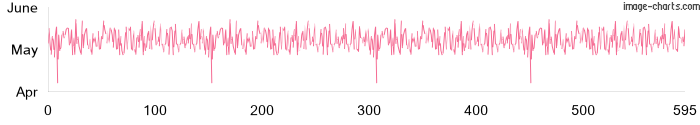
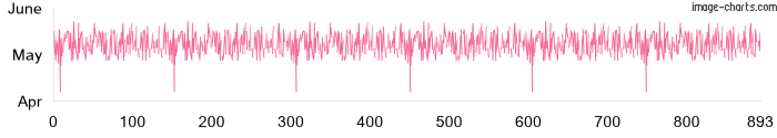
Your line chart will look like a confused jumble with too many data points. So, take care to not overestimate those. It’s better to create multiple sparklines to cover several ranges/series rather than smushing it all into one chart. Observe the graphs below to see what you risk with overpopulated line charts:
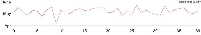
A 15 pixels/point sparkline with 40 data points

A 2 pixels/point sparkline with 300 data points
A pixel/ point sparkline with 600 data points
Less than 1 pixel/point sparkline with 900 data points
Whether you’re adding too many data points, lines, or colors to your line charts, stop to rethink the original objective. Effective line charts emphasize data changes and direction. They’re not displays of the size of the values themselves! Jumbled-up and difficult-to-read charts won’t help you make your point and can ruin even the best data.
Kiss, Marry, or Kill
All measurements on your chart’s horizontal line should be kissing close to regularly occurring intervals and corresponding data points. The line mostly defines durations. However, it can focus on other kinds of measurements, such as experiment iterations, baseball pitches in a match, etc. As long as the horizontal line meets the requirements, you can use it to demonstrate all measurement types.
Marry the lines in your chart to colors for different purposes:
- Identifying deviations
- Highlighting target goals
- Defining individuals within categories
- Indicating outliers in data sets
Kill the zero baselines in line charts that don’t require one. Only add it if it’s helping you tell your data’s story more articulately.
Down the Line—Product Details
Do line charts sound just awesome? But is making them one by one eating at your hours? Then begin using Image Charts as your line chart creator right away! By doing so, you’ll get to enjoy this tool’s many amazing features, including on-brand automated chart-making. Find several examples below:
- You can assign specific colors to the series in your data sets. Or specify different colors for different values in the same series.
- Choose the line thickness and style that would show off your data in the best way.
- Add various sized markers, i.e., different point styles, to the data points in your line charts.
- Find out how to create a line chart in excel here.
- Js chart construction and distribution are now possible too! Here’s how, along with chart js line chart examples
- Distribute and share via multiple methods, including MailChimp, Gmail, Team, Slack, and Zapier, Visualforce, and Email.
- Tell bigger and more interesting stories by turning your charts into gifs.
- Create keys to show the specification of each attribute in the URL.
- Embiggen *snort* your line charts with larger pixel values.
- Create Sparklines and Scatter charts to better showcase your data.
Parallel Lines—Why & How to Automate with Image Charts
Automation via Image Charts makes proactive collaboration easier. The simple interface is so user intuitive that it brings even complete beginners up to speed. In addition, the development hub houses short and simple tutorials even free users can access. Besides these cool benefits–and the wide spectrum of features mentioned above– Image Charts users also love being able to create charts with just one URL.
So, ready to automate? Do it through:
Zapier
Connect with thousands of apps through Zapier. Make and share charts without resorting to even a single code! A typical zap runs like this:
- Choose your data source as your Trigger, such as Typeform, Google Sheets, Email, CRM, etc.
- Select Image Charts
- Set your chart’s custom options, including advanced features like round edged bars
- Choose the chart destination, such as Slack, Teams, Email, etc. and add your new chart’s URL to your chosen vehicle for delivery and distribution.
Make
Leverage the Make-integration with Image Charts today. This is how scenarios work on Make:
- The first module is for you to pick your data source.
- In the second module, you connect to Image Charts and set up the options you want in your chart.
- The final module involves choosing your distribution vehicle, such as Gmail, Slack, or Teams, and adding your URL to send it forward.
API Option
The tool maximizes its user-friendliness by keeping the elements required to create most charts the same. For instance, all chart URLs are based on the same format. Adding chart type, data, size, labels, and other parameters, such as slices (for pie charts), gradients/slice, line thickness and styles, and marker type and size, allows you to finetune your chart to your liking. Once the URL transforms the info you input into a chart, you can paste it in the browser and share in multiple ways. Find detailed instructions here.
The End of the Line
Are line charts versatile? Yes! Are they useful? Highly! With Image Charts as your line chart maker, you can create all types of line charts, from a basic to spark line chart and scatter plots. So no more waiting for graph-making experts; do what’s best for your data!
Great Pickup Lines--FAQs
1. What are a line chart and its uses?
The simplest line chart definition would be a graph or plot that connects data points from within a series using a line. The sequential values in such a trend line chart can help you identify patterns. They’re mostly used when you need answers to queries, such as:
- Will we meet our quarterly/yearly goal?
- Are any patterns developing in the data over time?
- Which category is outperforming the others?
- Is there an upward trend or a downward one?
2. What is the benefit of a line chart?
Line charts are ideal for demonstrating the rate–change over time–and trends. Therefore, they can be useful in predicting and forecasting as yet unrecorded data. Finally, you can also use line charts to demonstrate one independent variable's effect on several dependent ones.
3. What are the limitations of line charts?
Like all chart types, line charts also have limitations. One of them concerns data granularity. The more points you stuff into one chart, the more unclear they will become. Therefore, users should weigh the bar chart vs line chart pros and cons and look at other types, like stacked bar charts or sparklines, when presenting such data.
4. How do you use a line graph?
You can use a line chart for displaying change in your data sets over time. The points will be connected by line segments on two axes. Since one data set’s dependent on the other one, your line chart will help you determine the relationship between the two.
Read more about line charts in our documentation here.


