
A Person Walks into a Bar…
If you’ve been going through life wondering what does a bar chart show, then keep reading. Below, we’ll be discussing the essential you-need-to-knows about one of the most fundamental ways of data visualization.
So, a bar chart is also known by other names, such as a column chart or a bar graph. It plots the figures for different levels of a categorical feature in the form of…you guessed it, bars. Since it has two axes, and one of them shows the levels, the other axis is where you plot the values of said levels. Simply put:
One bar = one categorical value or label.
Some examples would be:
- Industry types
- States/Countries
- Visitor types, such as free, basic, or premium
- Object size, like small, medium, or large
- Website accessing methods, such as mobile or desktop
And so on.
However, bar charts aren’t always limited to displaying categorical values. Some such graphs are based on groups of non-categorical values, too. For instance, a company may divide its fiscal year into four quarters of three-months-each. Therefore, the aggregation of this temporal data could be 2023-Q1, 2023-Q2, and so on. What’s important here is the groups need to be distinct.
Bar length = bar’s value.
The bar—and value—depend on the second variable’s values. The latter can be sourced from anywhere and may represent the frequency or proportion instead of numbers. For instance, the bar chart below shows you how much alive a certain employee can look vs. the cups of coffee they’re putting in themselves!

Put Your Best Bar Forward--Variations
There are, of course, several types of bar charts. Each of them is better suited to specific forms of data and achieving different objectives.
Let’s look at a few types, and you’ll begin to see why this is so:
Horizontal Bar Chart vs. Vertical Bars
You can choose to orient your chart vertically. That’d mean plotting the categories horizontally. It works oppositely for a vertical graph.
A horizontal bar graph is a better choice when your category labels are extra-long, like:
- Lord of the Rings—Fellowship of the Ring
- Lord of the Rings—The Two Towers
- Lord of the Rings—Return of the King
With the labels being this lengthy, they’d overlap and be illegible if you went with a vertical chart.
Stacked Bar Charts
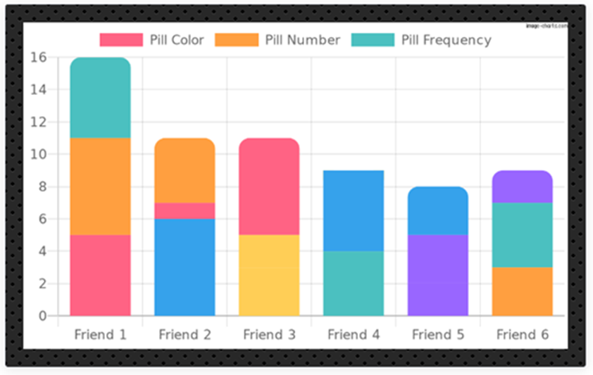
What is a stacked bar chart is a common query among bar chart noobs. When you divide every bar into smaller ones to demonstrate the values of a new grouping variable, that’s what you end up with! This way, you can run comparisons between the values from the primary group and those of each secondary group.
Take the graph below as an example. It’s showing other ahem creative routes Morpheus could have gone when offering the proverbial pill to Neo:
Histograms

You may consider the histogram (like the one you see above) to be a vertical bar chart or a separate sub-type. It’s used for displaying a range of continuous numbers. Since the values are so close, the bars are smushed up.
In histograms, the bar lengths correspond to the frequency of data points, while their pattern demonstrates the variables’ distribution in your data. A line chart will be a better choice for data visualization if the vertical value isn't a frequency count.
Grouped Bar Charts
The sub-bars of a grouped bar chart are placed side-by-side—hence, the name side by side bar chart--and bundled into clusters instead of being stacked on top of one another. While you cannot compare the primary group totals from these graphs, they allow for a better comparison of the sub-groups.
Up to Bar—Use Cases
Data visualization plays a role in almost every industry that keeps track of performance. Since they can demonstrate both qualitative and quantitative data, we’ll see bar chart use cases in almost all such sectors. Of course, the variables under analysis and the target audience determine the type of bar graph used for data visualization.
Some examples include:
- Corporate sector - Data sets comprising ROIs from the different departments of an organization and across different timelines, such as annual, bi-annual, etc.
- Manufacturing sector – Bar charts can display price variation of a company’s product, in the same or different countries, and across different periods.
- Real Estate sector – Bar graphs can demonstrate the total sales of different kinds of properties over a specific time period.
- Tech sector – Plots that count pageviews for websites over certain time periods are in common use.
- Banking/Finance sector – Bar heights depict average transaction sizes for various methods of payment.
- Healthcare sector - Sales figures across several sub-types of care provided from different years.
From the ubiquity of its usage, it won’t be a stretch to say the world is indeed your bar chart!
Bar for the Course—Most Common Uses
We’ve peeked at where they’re used, and now let’s discuss what is a bar chart used for. Unsurprisingly, many things! However, those cases can be bundled into distinct groups—we could create a bar chart with data about bar chart creation!
Let’s check where else we might find bar charts in the wild:
To Show Change over Time
A most common application because these charts are often used to show or understand how a certain variable changes across time. The usual practice in such cases is to place time on the horizontal axis, so it’s read left-right while the values of the variable-of-interest are on the vertical axis.
Showing Part-to-Whole Configuration
Just as the example above can help you figure out the weirdness levels of your pals, bar charts allow observers to study the components comprising the total value of a variable. And while vanilla bars will work, too, a stacked bar chart is your best bet for such deductions.
Showing Data Distribution
Most data handlers use bar charts for this method during the initial phases. Plotting values clarifies their understanding of the data’s properties.
Simple bar charts are used to show the distribution of qualitative variables with various discrete values. Histograms, on the other hand, are useful for quantitative variables with different numeric values.
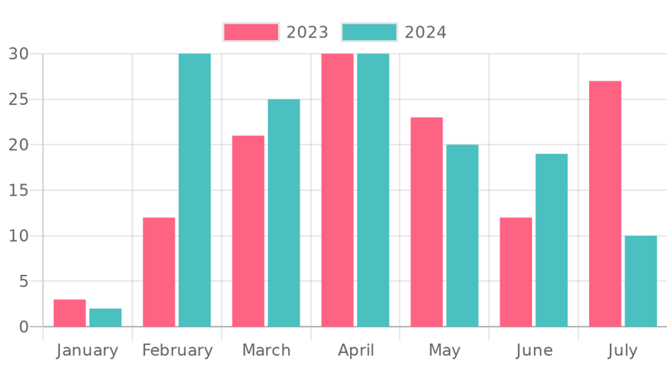
Comparing Values between Groups
This data visualization application can be seamlessly combined with the other roles mentioned above. Multiple bars are plotted at each location for this purpose.
On Bar with—Best Use Cases
You may be a newcomer or a veteran bar chart maker, but we’d recommend sticking to the guidelines below to get the most out of your charts:
Good Baselines are Common and Zero-Valued
In other words, the lowest entry for a variable should be zero—that’s where your bars should begin. This serves two functions:
1. Makes it easier for a reader to compare the length of one bar against the other
2. Maintains the integrity of your data visualization
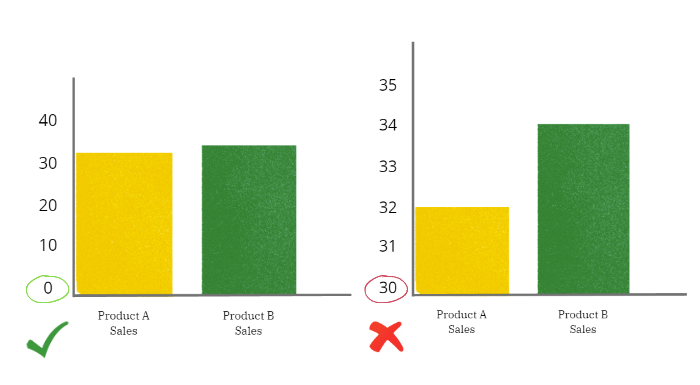
The graph above exaggerates a negligible difference. Non-zero baselines lend themselves to misrepresentation easily. Your aim should be to match the different bar lengths to the actual ratio between the bars’ values.
Good Bars are Squares
Messing with the bar’s shape can affect the accuracy of your data’s visualization! For instance, rounded bar caps can confuse readers about the variables’ values. After all, the more curved that dome is, the farther away its tip will be from the rest of the bar.

Similarly, 3-d effects can make it harder to figure out bar lengths. They may also keep the baselines from aligning.

So, avoid them!
Well-Constructed Bar Charts Follow Orders
When you insert various bars in an out-of-order way, you’re forcing your readers to mentally rearrange them before they can compare! Convention recommends starting with the longest. You may eschew that standard if you have a genuine reason for the way you’re ordering your inherent category’s label.
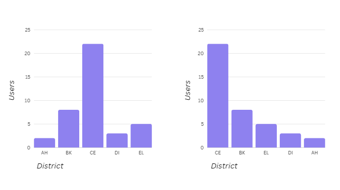
The district codes aren't mentioned, so sticking to the standard arrangement is okay.
Great Bar Charts are Colored with Purpose
Consider how you leverage the colors. Different colored bars may imply additional meaning to an audience where there’s none—or add layers to your chart-based story that just aren’t there.
Therefore, it’s best to apply colors:
- To only highlight columns you’ll be using in your story
- With meaningful connections to the categories you’re posting, such as the company/brand’s or team colors
Awesome Bar Charts Come with Value Annotations
This addition makes it easier for readers to compare bar lengths and find the approximate values. So, annotate important values by marking the middle or end portions of the bars.
Setting the Bar—Product Details
Bar chart enthusiasts should check the not-so-new-kid-on-the-block, Image Charts. The tool has a large range of chart templates you can piggyback on or create one manually. Either way, once the data’s in, Image Charts produces simple, embeddable charts. Paid versions come with integrations that seamlessly merge with your tech stack.
Here are some of its best features regarding bar charts:
- You can create various bar charts, including horizontal and vertical, and grouped or stacked versions.
- Add colors—solid fills or gradients--based on the bars, the series they’re in, or multiple series.
- Want to host Image Charts on your infrastructure? That’s doable with the OnPremise plan
- Change boring graphs into gifs; learn how here.
- Make even more types of charts by changing or adding encodings.
- Give your charts that extra sparkle with secondary encodings for area, colors, and shapes.
- Don’t know how to make a bar chart in Google sheets easily? That’s because you’re doing without using Image Charts.
Finally, set up chart automation so that Image Charts does all the heavy lifting for you!
Show Bar Mettle—Why Automate Graph-Making
If you knew how huge a difference automating can make, you’d want to begin right away. But we’ll only mention the three meatiest of advantages below:
- Automation will save you oh-so-much time since Image Charts integrates with various platforms using Zapier, Make, or an API, including Slack, Google Sheets, Gmail, and so on.
- Since the automation process is easy-to-follow, you won’t have to pay an expert to create charts for you every time you have to present them. Or, look for IT expertise or QR codes whenever you need to share them.
- Once you automate, you will alleviate the headache of creating charts from scratch.
Put Bar Thinking Cap on—Automation with Image Charts
Whether you choose to automate your graph with Zapier, the API, or Make, here’s how each works:
Automation Tools
Best for people who don’t have a background in development to do it manually and those who want to save time. Your two options are:
Zapier
Another way to automate. First, connect with Zapier and then with thousands of other apps through it. Automate the process, aka zap, without the need for codes like this:
- Start with the Trigger or selection of the source of your data. You’ll see different options, including Email, Typeform, CRM, etc.
- Connect with Image Charts and set up your chart’s features.
- Next, pick the destination to which you can add the chart’s URL.
- Send out your chart!
Make
For Image Charts users who want to try the Make-integration, you’ll be running a scenario:
- Again, begin by choosing your data’s source.
- Now connect to Image Charts and finalize the features for your chart.
- Select the vehicle to distribute the chart, add the URL, and forward it.
API Option
The basics of using the API option begin with you learning what the URL looks like. Whether you’re using Image Charts as a bar chart creator or making another chart, all URLs start with https://image-charts.com/chart. They then follow up with variables defining your chart specs, as follows:
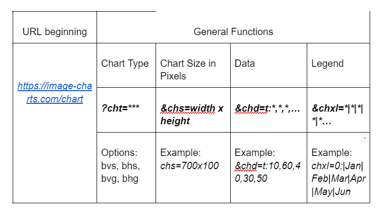
Once done, this URL is good for pasting in your browser. You can add further customizations by adding more variables, such as chbr for rounded edges. See all options on the bar charts documentation.
Down to the Last Bar
Choosing the exactly right chart for the job is a most important factor in data visualization and presentation. You must look at the variables and decide what you want to get out. Quick and easy production—and reproduction—of your chart-of-choice is equally essential. Using the star bar chart maker, Image Charts, doesn’t just streamline this process; it also helps chart-makers extract additional insights from their creations. Try the free tool to see where Image Charts takes you!
Bar & Away--FAQs
What is a bar chart?
A graphic way of presenting the different values of variables, such as data, quantities, or numbers, in the form of bars is a bar chart. They are great tools for compare-and-contrast purposes.
How to make a bar chart in Excel?
Why’d you want to know how to create a stacked bar chart in excel when you can input your data into Image Charts and let it take care of your chart-making needs? Scroll upwards to see how!
What is the difference between a bar chart and a histogram?
Histograms are usually rooted in values that are very close together. Therefore, when plotted, they look like bar charts without spaces between the bars.
In a bar chart, which axis displays the categories?
The vertical axis shows the categories, while their values usually end up on the horizontal side.
Read more about bar charts in our documentation here.


