
Pie charts are one of the most commonly used charts in the world. You see them in the finance markets, business meetings, and mathematics textbooks. Today’s blog post will discuss these special diagrams in detail. We’ll explore why pie charts are important and provide you with an automation option to help you be more effective and efficient. So, let’s begin. First, the basics!
What Is a Pie Chart?
Pie charts are simple to define. They are a type of circular statistical graph that is divided into various slices. These radial slices represent numerical proportions where each categorical value corresponds with a given slice. In addition, the size of these slices is important. They indicate the overall proportion a category takes in area and arc length.
Here’s what a pie chart looks like:
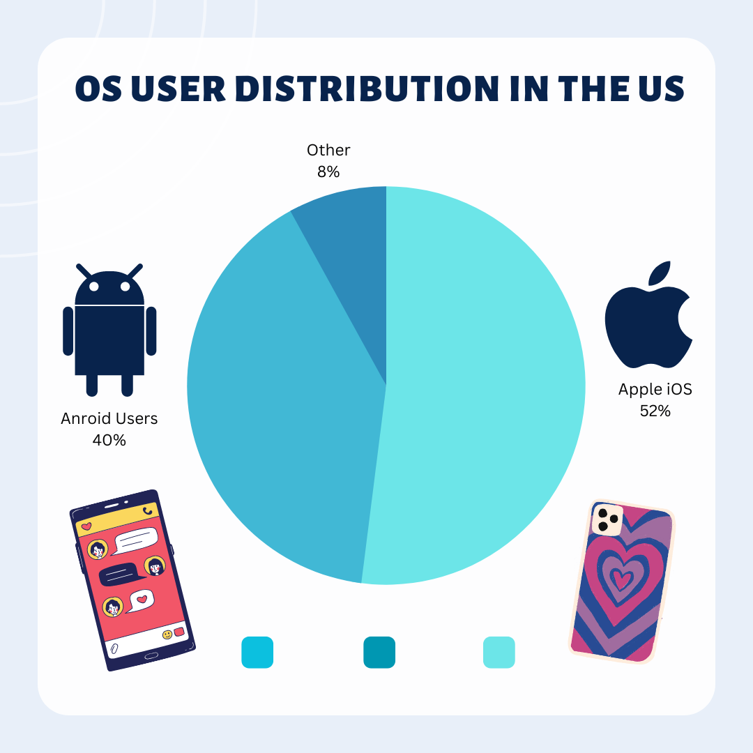
The above diagram depicts the market distribution for US cell phone users. We can see that the blue slice represents Apple or iOS devices with an overall proportion of 52%. The second slice is yellow and represents the number or percentage of Android users. And lastly, the third slice shows us the remaining users. They do not fit into either category.
Pie charts will usually have annotations that provide context to aid with visualization. You can see them present on the left, right, and bottom of the image above. They include precise values and coordinating colors.
What are Pie Charts Used For?
Pie charts have very specific use cases. As their definition suggests, they can be used to divide a whole amount into several distinct parts. This is so users can visually represent the data for comparison. But remember, the primary objective never changes. So, you will always use slices and groups on the chart to understand or compare their contribution to the whole. Hence, you’re not going to consider how these groups or slices affect each other.
Therefore, if your objectives do not match the above statement, you should try using a different plot type.
The values on a pie chart that make up the slices and categories generally come in two varieties. First is the “Whole,” which represents the total count. For instance, the total number of cell phone users in the above chart is divided by the type of device.
The second variety is the “Parts,” which compares different elements or subcategories. For instance, if the whole is a business’s total revenue, the parts would be the revenue generated by each department or product line.
Other Uses of Pie Charts in the Business World
We commonly use pie charts in the business world to visually represent data. For example, a company might use one to show the percentage breakdown of sales by product category or the expenses by department. This chart also helps business leaders quickly identify key insights - for example, which products or departments generate the most revenue or incur the most expenses.
In addition, pie charts can also be used to compare data across different time periods. For instance, a company might use one to show how yearly revenue streams have changed. On the other hand, they may compare the market share of different companies within a particular industry.
Finally, pie charts are used to illustrate a point or tell a story. This is thanks to the use of different colors or patterns. They help users differentiate between different segments of the chart. So, business leaders can use them to draw attention to particular areas of interest and highlight specific trends.
5 Tools Commonly Used to Make Pie Charts
Pie charts are like the pizza of data visualization - everyone loves them! They're a great way to show how a whole divides into different parts. Here are five commonly used tools to create pie charts:
Microsoft Excel: Excel is the OG of data analysis and visualization tools, and it makes creating a pie chart super easy. Just select your data and hit the "Pie Chart" button!
Google Sheets: If you're looking for a free and easy-to-use tool to create a pie chart, Google Sheets is a great option. You can easily customize your chart and add it to a Google Slides presentation.
Canva: Canva is a popular design tool offering many data visualization options, including pie charts. It's perfect for creating professional-looking diagrams for presentations and reports.
Tableau: If you're dealing with complex data sets and need to create more advanced pie charts, Tableau is a powerful option. Data scientists and analysts use it to develop interactive and dynamic visualizations.
Piktochart: Piktochart is another graphic design tool that offers a range of data visualization options, including pie charts. It's perfect for creating infographics and reports that require visually appealing and informative diagrams.
The Unfortunate Downsides that Come with Manually Creating Pie Charts
Manually creating pie charts may seem like a simple, straightforward task. But there are several downsides to doing so, especially in a business setting where accuracy and efficiency are crucial. Here are some of the potential drawbacks you should know:
Time-consuming: Creating your own pie charts can be time-consuming, especially when dealing with larger data sets. This process takes up valuable time that you can spend on other tasks.
Prone to errors: Manually creating pie charts increases the risk of user errors. For example, miscalculations and incorrect labeling. These errors lead to incorrect conclusions and decisions.
Limited customization: Manually created pie charts can have fewer customization options. This makes it difficult to accurately represent the data and convey the intended message.
Limited scalability: A single business or person can only create a few pie charts when dealing with larger data sets. Unfortunately, the process can become overwhelming and time-consuming. Thus, resulting in charts lacking scalability.
Inconsistent presentation: Manually creating pie charts results in presentation inconsistencies. This is because different individuals may have different approaches. For example, they may use different styles to create charts, resulting in labeling, color coding, and other design inconsistencies.
Difficult to update: Updating the pie chart can be cumbersome, especially if the data you use changes regularly or if multiple charts need to be updated simultaneously.
Automating Pie Charts – Why Should You Do It?
Pie charts are invaluable tools for visualizing information. However, creating them isn’t easy for businesses, companies, and individuals. This is because they require manual effort to categorize variables, create tables, and organize information. Unfortunately, as we know, this process is incredibly inefficient.
So, what are your options if you want to improve how you generate pie charts? Thankfully, the answer is straightforward. You stop manually creating them and, instead, focus on automation.
Automating the process of generating pie charts can change how you work. It can reduce the overall amount of time you spend working, and even improve accuracy as you develop and create multiple charts.
Here are some more benefits of automating pie charts:
Better Productivity and Efficiency

Automating pie charts can significantly boost productivity levels. So, it’s a worthwhile option for businesses and individuals. The same time and energy you or your workers spend sorting through data can go toward other, more important tasks. Thus, leading to more efficient work.
Fewer Mistakes
Humans are not machines. So, it’s no surprise that mistakes slip through the cracks when we work on repetitive, monotonous tasks. And there’s nothing more tedious than manual data entry and creating pie charts. Most of us are so caught up that we just rush through it. Now, imagine if you didn’t need to worry about every detail. That’s what automation offers. It allows us to free up time, as the above section suggests. But it also takes the tedious tasks off our shoulders. This leads to not only faster work but also more accurate efforts.
Reduced Labor Costs
Spending time generating pie charts can also lead to higher labor costs. This is because workers will need to allocate additional time to create them. Of course, more hours on these tasks means more expenses as workers are less efficient. Thankfully, automating pie charts fixes the problem. It enables workers to spend less time on useless tasks, and thanks to their boosted productivity, it allows you to reduce costs.
How to Automate Your Pie Charts?
Now you know the basics of pie charts and why automating them is a good idea. But how can you actually do it? Well, it’s pretty simple! There’s only one real option for anyone who wants to automate chart generation. It’s Image Charts!
Image Charts Simplified
If you want to automate your pie charts, there’s only one place you go. It’s Image Charts. Thanks to its automation options, this tool lets everyone, including businesses, enterprises, data analysts, and developers, make the most of their time. So, you can say goodbye to any of the common problems above. All users need is to set up the automation process and let image charts do the rest.
But don’t worry! This process isn’t tedious. It all depends on you! For example, anyone can use the free chart editor immediately. jumping straight in means quicker pie charts! In the paid tool, Image Charts offers options for customization. So, you can change everything, including the colors, texts, formats, and sizes and tailor it to your brand.
For developers, automation is available via API. However, you shouldn’t worry if you can’t code because Image Charts also offers options for less tech-savvy users. This is thanks to the native integration with Zapier and Make that lets anyone create, edit, and share their pie charts. You simply need to access Image Charts through the respective automation tools and set up the processes.
After that, it’s as simple as changing the variables and watching it update in real time. Lastly, Image Charts makes it easy for users to convert and share their data. So you can easily send reports and PDFs to your team members via email. Here’s a quick guide with a little more detail to help you automate your pie charts:
Automation with Make and Zapier
Start by accessing the Zapier or Make websites and select a specific data source. For example, you can choose to draw information from apps like Google Analytics. To access the data, you need to use a “Trigger” or a “Module.” Think of these as action steps that you can use to connect with your data source and authenticate it.
Next, it’s time to integrate it with Image Charts. So, add another action step and choose to generate a pie chart. Then, simply customize the various fields, colors, and fonts.
The next step is to share the pie chart so you can use it for your next business meeting. So, add another action step and select and authenticate a destination platform. For example, you can connect Zapier and Make with Gmail.
Once you’ve completed each step, just finalize the Zap or Scenario! It’s that easy.
Other Benefits That Users Get with Image Charts’ Automation
There are several other reasons why automating pie charts with Image Charts is a good idea. But we’ve compiled a few additional benefits that may interest you. So, check the list below:
Free Tool
Image Charts has a free option for people who want to start making and editing pie charts. So, you just need to visit the website and use the free online editor. It allows users to start immediately by selecting the type of chart they want to use. However, you’ll need to manage your Image Charts subscription plan if you want to automate the process.
In-Depth Guides
You can access detailed guides if you don’t understand something about the services or charts. This is because Image Charts provide support for every kind of automated graph. So, simply check their documentation if you need help with your custom pie chart.
Community Support
If all those variables are giving you some trouble, stop by the Stack Overflow community and drop down your Image Charts grievances. You will get all the help you need from fellow users or even the owner!
Conclusion
In conclusion, pie charts are simple yet powerful tools for visually representing data. They allow users to easily compare different parts of a whole, identify key insights, and highlight specific trends. However, manually creating them is not a good idea. Therefore, businesses and individuals should look for alternatives like automation with Image Charts. Generating pie charts saves time, reduces errors, and achieves greater scalability, customization, and consistency. So, try automating your pie charts today!
Read more about pie charts in our documentation here.


