
Graphs are commonly used to visually illustrate relationships between data. The objective behind using a graph is to show data that is too complicated or numerous to be represented in the form of text. Graphs aren’t ideal for small amounts of data, which you can easily convey in a sentence. When the data reveals relationship between two variables or shows pronounced trends, you will be required to rely on a graph. In the absence of a trend, it’s hard to justify the use of a graph.
So, how to create a chart? There are many computer programs for this purpose, but they are either not user-friendly or they lack the required chart types.
However, recently, Image Charts has gained traction when it comes to creating quick and professional charts. Here is a brief tutorial on how to use it for creating charts.
GraphViz
GraphViz refers to a bundle comprising of open-source tools that is used to visualize connectivity graphs. You can use the DOT language to build GraphViz graphs and choose a layout engine accordingly. Here are the parameters supported by GraphViz:
- cht = gv[ : <opt_engine>] – Specify the chart type
- chl – Used to add input
- chs – Unlike other chart types, you don’t have to set a chart size. The output image will be converted into a suitable vector graphic
- ch1=<DOT_string> -- Write dot language notation to draw the chart
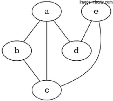
Simple Graph
Open the chart editor and type the following values:
cht=gv
chl=graph {
a -- b;
a -- d;
b -- c;
a -- c;
e -- d;
e -- a;
}
In return, Image Charts API will generate the following graph.
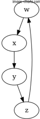
Digraph
A directional graph is a type of graph in which edges have a direction. You can create it by setting the following code in the chart editor.
cht=gv
chl=digraph {
a -> b;
b -> c;
c -> d;
d -> a;
}
In return, Image Charts API will generate following graph.
Bubble Charts
Bubble charts are used to visually represent multiple dimensions of data – usually three to four. This allows you to show at least three fields in a graphical format. As a result, you can use it to for a detailed and advanced analysis. Each series represent a set of bubbles that are defined by x, y, and an optional value: r (radius).
With Image Charts API, you can create different types of bubble charts. The syntax for bubble chart is specified below.
cht =<chart_type>
Here, <chart_type> refers to “bb” or a bubble chart comprising of data points. By default, it does not show axis lines. You can show values on the axis lines by setting up the axes.
?cht=bb
&chs=800x400
&chd=t:30,50,20,_,57,30,14,_,12,14,50,_,10,30,30
&chco=6213AB
&chxt=x,y
&chma=0,0,20
In return, Image Charts API will generate the following graph.
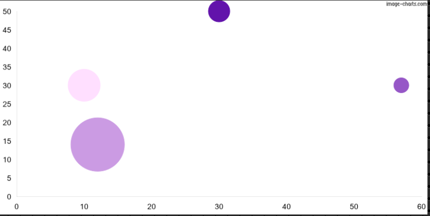
You can specify series of x, y, and [r] to set data points in bubble charts. However, these series have to be separated by “|”.
Polar Area Charts
When you have to show proportional part-to-whole visuals, polar area charts are your best bet. They can be made both in terms of single series as well as multi-series. Each series represent one pie and each data value shows one slice. Utilize multiple series to make use of overlayed polar charts. In order to display the text for a slice, work with a chart legend, which will be represented by a text representing color.
Open the Chart Editor and set the following values:
cht=pa
chd=t:100,200,300
chdl=A|B|C
chxt=x
chco=FF00007F,00FF007F,0000FF7F
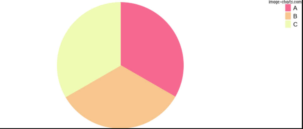
Since values are relative to each other, therefore setting values of 100, 200, and 300 is same as setting 1, 2, and 3 as your values. Also, keep in mind that negative values are shown as empty slices.
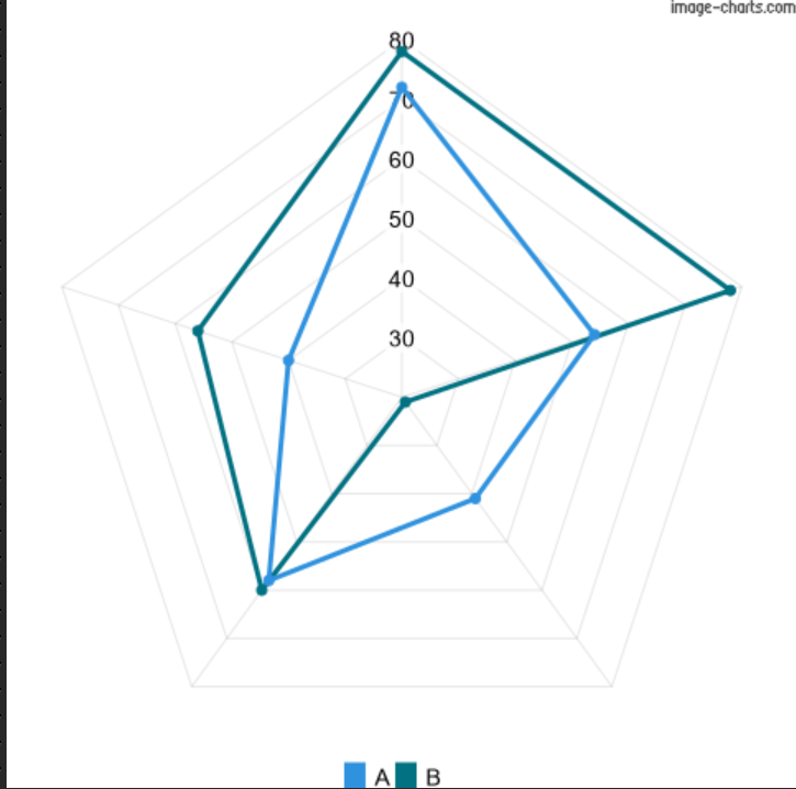
Radar Charts
Radar charts draw data points in an even and clock-wise format. A data point shows distance from the chart’s center, whereas the center itself is used to represent the lowest value, and the maximum value is represented by the chart’s edge. Therefore, you can say also that a radar chart is basically a form of line chart that is wrapped into a circle. It is distinguished by its equal segments. The tally of segments is always greater in value than the following:
- The number of data values
- The number of labels + 1
For example, if a chart has 12 data points and no labels, it will be spaced 30 degrees apart. Open the chart editor and set the following values to create your radar chart.
cht=r
chxt=r
chd=t:72,54,41,58,40,72|78,78,21,60,56,88
In return, Image Charts will generate the following chart.
Final Charts
Now that you have learned how to create different charts with Image Charts API, you can go through the complete documentation and build more advanced charts. In this way, you can integrate charts faster in your applications and allow your programmers to focus on other areas.
In case you have any issues with creating any chart or if you don’t know which chart is the best for your data visualization requirements, reach out to us for help.


