
Everyone’s seen pie charts. They’re a circular illustration of statistical information that makes you a little hungry if think you about it too hard. Their main purpose is to create a visual representation of numerical proportions, and they perform that purpose very well. Each segment (or “slice” if you’re feeling hungry already) represents a proportion via angles or percentages.
So, in this guide, we will discuss how to measure the angles of a pie chart to present given data sets for real, numerical value, and quantity.
Why Measure the Angle of a Pie Chart
But first, let’s talk about why you need to measure the angle of a pie chart.
As a circle, a pie chart gives you 360 degrees to work with. This will dictate the angle of your segments. Ignoring this information will cause your chart to be skewed and visually deceptive, especially if you try to eyeball the proportions.
That means we’re going to have to do some math, but don’t worry, we’re not even solving for X.
The angle of segment = Frequency of data/Total data frequency x 360.
In layman’s terms, divide the data you wish to represent by the total dataset. This will give you a decimal percentage. Multiply that by 360, and the resulting number is the angle of the segment.
It’s that easy.
And if you’re no fan of math, don’t worry, there are tools that make pie charts easier.
How to Measure the Angle of a Pie Chart in Google Sheets
It is easy to make a pie chart using Google Sheets, but we’re going to give you a quick step-by-step so you don’t have to figure it out for yourself.
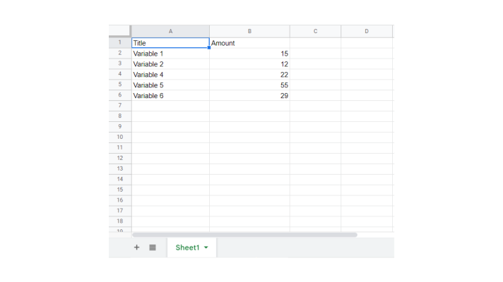
First Input the Data You Want to Represent into a Table on Google Sheets
In this case, we’re going to make a simple 2-column table for right now where Column 1 is the name of the variable and Column 2 is the amount we wish to measure.
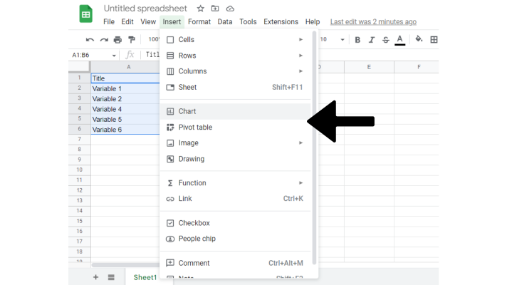
Next Select Your Table and Create a Chart
From here you will highlight your chart by selecting the top left cell of your table, and shift-clicking the bottom right cell. Once highlighted, open the Insert drop-down menu and select Chart.
No surprise here, this will create a chart of your data. The chart may default to a pie chart. If it does not, simply select your chart. This will open the chart editor on the right side of your screen. Then select the pie chart in the Chart Type Drop Down Menu.
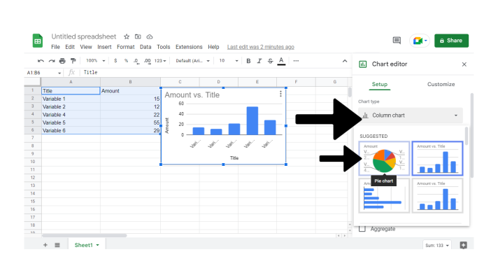

And there we are. One pie chart fresh out of the Google Sheets oven. For more options on how to customize your chart, explore the Chart Editor to adjust color, labeling, and more.
How to Measure the Angle of a Pie Chart in Excel
Microsoft Excel and Google Sheets are very similar in functionality. However, everyone has their own favorite tool. So no one is left out, we’re going to take a look at how we can use Excel to measure the segment angles and make a pipe chart.
Begin by Creating Your Data Table
In very much the same way we began in Google Sheets, begin by opening a new workbook in Excel. From here you will create your data table in the same way.
And in the same fashion as before, by selecting our top-left cell and shift-clicking our bottom-right cell, we will select the table.
Create Your Chart
Once your table is selected, select the Insert tab at the top of your screen. Here you find a number of options for charts. Simply select the icon of a pie chart to select the style you’re looking for.
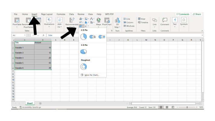
For our purposes, we’re going to select the first 2-D pie option.
Modify Your Pie Chart
Once your pie chart is created, Excel allows you to modify it according to your preferences in the top control panel.

And that’s all there is to it. It takes a little time, but that’s how you create a pie chart in Microsoft Excel.
The Easiest way to Build Any Chart
If you’ve read this far, you’re probably still thinking “There has to be an easier way.” After all, even with this quick and easy guide, both Google Sheets and Microsoft Excel can be time-consuming options for making effective charts.
That’s not even to mention the different steps for the other graphs you need to make. The old pie graph is a tried-and-tested tool, but it has its limitations.
Thankfully, there’s a solution to make your charting dreams come true.
Image-Charts provides a quick and easy way to make impactful, instant custom charts that you can embed anywhere you need to display meaningful back-end data. Never waste your time inputting data into a spreadsheet for lackluster charts ever again.
You can build a chart for free in the Chart Editor, and if you need superpowers in your charts - like automating chart creation with Zapier or Make - you can do it with their Business or Enterprise paid plans.


