
If you thought that you could only embed charts with Zapier or Google Sheets, think again. Microsoft Excel is an excellent tool for this same purpose that allows you to embed and send charts in Excel via an email template. This way, you and other users can edit the Excel charts and graphs via email.
Using this method, you no longer need to resend a new file every time you make a change. You can do the same using a Microsoft Word document by embedding an updatable Excel chart or graph. This synchs your data and prevents you from having to make changes separately.
If you are still considering Zapier, you can learn more with our guide on the ins and outs of the service.
But if you want to learn how to Embed and send charts in Excel, this is what you have to do.
How to Embed and Send Charts in Excel
Step 1. Open Outlook and Excel at the Same Time
First, open both Microsoft Excel and Outlook applications at the same time. This allows you to see if everything is transferred correctly.
Step 2. Select the Chart or Graph and Copy it
Once both applications are open, it’s time to copy your chart or graph to the clipboard. Open the Excel file that contains the chart or graph you want to embed. Be sure to click outside of the graph to ensure you copy the entirety of it. Otherwise, you risk copying a single element.
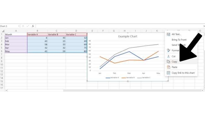
You can right-click the chart and select the option to copy, or you can also use the keyboard shortcut: Crtl+C while the graph selected. Either way, your chart is now copied to your clipboard.
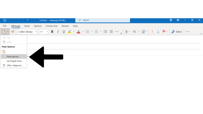
Step 3. Paste the Chart or Graph in the Email Template
In the top-left corner of the application, you’ll see the option to paste. Select that, and select the option labeled Paste Special. You will then be presented with a dialog box.
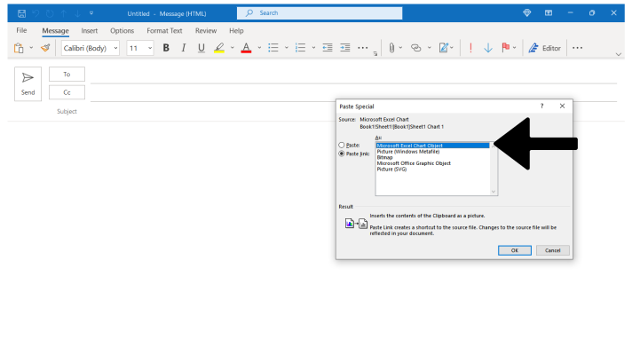
This dialog box will present you with two check boxes: Paste or Paste Link. Select Paste Link.
From there, you will be presented with a number of formats you can paste your link as.
Select Microsoft Excel Worksheet Object, and select OK to paste the chart into your email.
Your chart will now be correctly pasted into the Email.
Step 4. Update the Link to the Chart on the Outlook Application
Now, for the next step of how to embed and send charts in Excel: checking the synchronization. The chart will not update on its own, but don’t worry. Right-click the border of your embedded chart, and select Update Link. Afterward, any and all modifications to the Excel chart or graph will be synchronized into your email template.
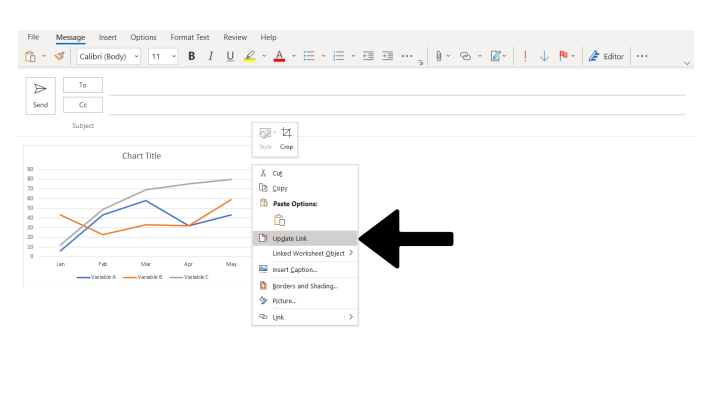
This is how you will need to follow this last step every time you wish to send your email as it ensures that your chart is up to date with the latest modifications.
And that’s how you Embed an Excel Chart Into an Outlook Email Template.
How to Embed Excel Chart in Word?
So, we’ve discussed at length about Outlook and emails. So, it’s time to go over how to Embed an Excel Chart in Word.
Don’t worry, this process is a lot simpler.
- Click the Insert in Microsoft Word.
- Select Object in the Text Group
- Choose Create from File, and select Browse
- Select your Excel chart and select the Insert option
- From there, check the box beside the text Link to File and press OK.
A Final Word
And that’s all there is to it. And if you ever forget, you can return to this simple guide on how to embed and send charts in Excel.
But are you looking for a more intuitive solution to keep your embedded charts up to date? Would you like to be able to instantly render charts that look great and match your branding? Utilizing tools like Excel and Google Sheets is fine for simple projects, but they can become a serious time sink just to get mediocre results.
Image-Charts makes it possible to embed and update charts with data from anywhere and any place with a custom API for making custom charts. Skip hours of work with a tool that works with your existing workflows in any environment that renders HTML code.Check out Image-Charts today if you’re looking for a professional chart-making service to help streamline the process of embedding and updating live charts wherever you need them. It’s the fastest and easiest way to visualize back-end data available.


