
How to Create a Spider Web Chart
Everyone is familiar with pie charts, bar graphs, and the like. They allow us to chart data with discrete ranges. However, what do you use when confronted with multiple data sets with numerous common variables? If you’re looking to represent that data in a single chart, you’re looking for a spider web chart.
What is a Spider Web Chart?
The spider web chart, also known as a web or polar chart, is a graphical representation of a wide variety of data. It allows us to visualize many groups of values with multiple common variables on a single chart. As such, the spider chart, sometimes known as the radar chart, allows us to easily depict multiple variables side by side.
This makes it excellent for illustrating and comparing data such as quarterly profits by year, for example.
But first, you have to know how to make one.
How to Create a Spider Web Chart in Microsoft Excel
To start with, we’re going to go over how to make a spider web chart in Excel.
Go ahead and open a blank sheet and follow these steps.
1. Enter the Relevant Information in Excel
Begin by creating a table of the data you wish to represent. This is standard practice for creating any chart in Excel.
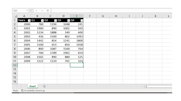
This is the table we will be using for this example.
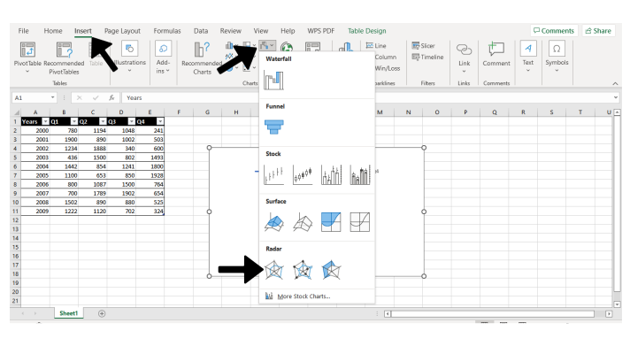
2. Add the Radar Chart to the Sheet
Next, select your table by selecting the top left cell and shift-clicking the bottom right.
Now click on the insert tab at the top of your screen. Then select Other Charts.
From there you will be able to select from three radar charts at the bottom of the drop-down menu.
3. Add Data to the Chart
Now you should have a spider chart of your data. But something doesn’t look quite right, does it?
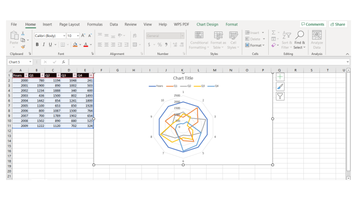
That’s because we need to fix the data.
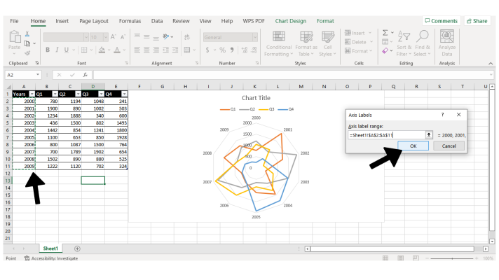
Right-click your new radar chart and select Select Data.
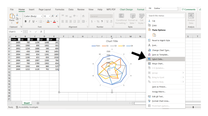
From here you will be presented with a dialogue box. In this case, uncheck the box labeled Years under the Legend Entries section on the left. This will remove your years column from affecting your chart.
However, we still want that column for our horizontal axis. Under the Horizontal Axis Labels, select Edit

Now, simply select your years column excluding the title by click-dragging. Then click okay.
Now you have a simple spider chart ready to go! Simply apply this process to any table of data that shares common variables.
How to Create a Spider Web Chart in Google Sheets
Now that we’ve covered how to create a spider chart in Excel, let’s take a look at how to do the same in Google Sheets.
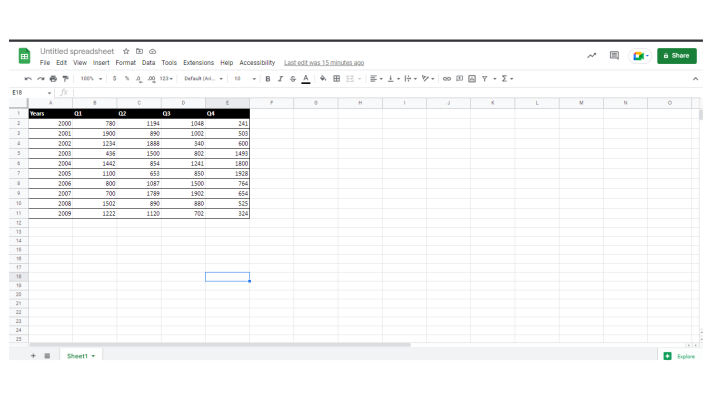
1. Enter the Relevant Information in Google Sheets
To create a spider web chart in Google Sheets, we’ll start the same as we did in Excel.
Enter your information in a simple table like so:
2. Create the Radar Chart
As we did in Excel, we’re going to select the table from the top-left cell to the bottom-right.
From here you will select the Insert tab at the top of the screen, and then select Chart from the drop-down menu.

Now, Google Sheets will try to guess the best chart for your data to help you out, but we want a radar chart.
In the dialog box that appears on the right side of your screen, select the Chart Type drop-down. Then scroll to the Other section and select Radar Chart.
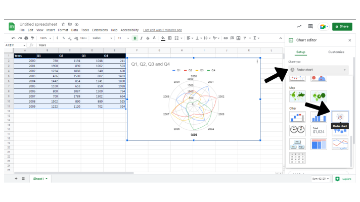
And that’s all there is to it! You now have one functional radar chart. To customize your chart further, explore the Customize tab of the same dialog box.
Make Charts Easy with Image-Charts
So, that’s how you can make functional spider charts in Microsoft Excel and Google Sheets. It takes a bit of work, but you’ll get there in the end. But what if it didn’t have to be such a hassle?
What’s more, what if there was a tool that was able to give you better quality charts and was easier to use? Then we have good news for you. With Image-Charts, you’re able to create beautifully informative charts of any type in just a couple of clicks of a button. Better yet, with Image-Charts’ custom API, you can embed customized charts anywhere that renders HTML. Present your data in a way that leaves an impression, and is quick and easy to update from anywhere.Tell the whole story behind your data with live embedded charts. So, check out Image-Charts for your next project to achieve the impact you want out of your data presentation with half the work of other charting solutions. Set it up for free today in less than an hour, and generate unlimited perfect charts forever. Charting data has never been easier.


