
A histogram is a useful tool on its own. So is a curved line graph. However, they both have shortcomings when they stand alone. By combining a histogram and curved line in one chart, you’re able to depict data frequency and trends in the same graph.
That’s why today we’re going to look at how to combine these charts using Microsoft Excel and Google Sheets
How to Combine a Histogram and Curved Line in One Chart Using Google Sheets
1. Insert Your Raw Data and Create a Named Range
As with any chart in Google Sheets, we’re going to want to enter the data we wish to chart. In this case, we will be creating a single column of information.
Once that is done, select your new column of data.
With your column selected, select Data and then Named Ranges. In the dialog box on the right, select Done.
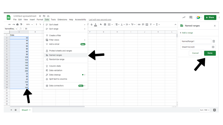
Name the range accordingly to what you’re trying to visualize with your data.
2. Create a Table of Summary Statistics
Now, from our new data range, we’re going to create a summary statistics table with the mean, median, mode, and standard deviation.
Don’t worry about all that math! We’re going to use Google Sheets’ formulas to do it for us.
Make a column of cells labeled mean, median, etc.
Next to that column, write these codes in the corresponding cells. Remember to use the name of the data range we created in the last step in the parentheses.
Mean: =AVERAGE(NamedRange1)
Median: =MEDIAN(NamedRange1)
Mode: =MODE(NamedRange1)
Standard Deviation: =STDEVP(NamedRange1)

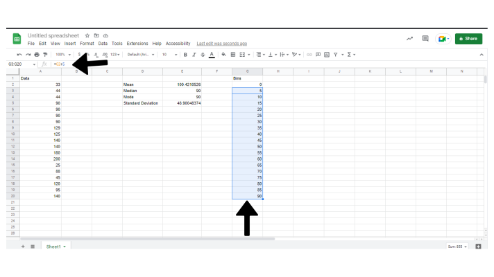
3. Create Frequency Bins
Next, we’re going to set up frequency bins. For our purposes, we’re going to use intervals of 5 in the G column. Don’t forget to ensure that the range of these bins includes your whole data set. If your data’s max value is 200, your bins will need to at least reach 200.
To save some time use this formula in the cell following 0 and drag the cell down the column.
=G2+5
Name this range as we did with the data in step 1.
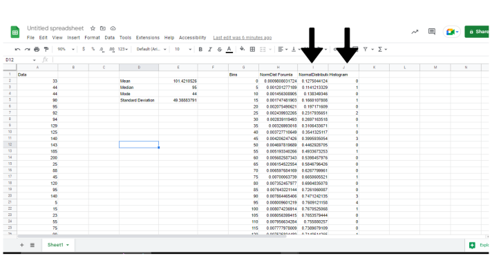
5. Normal Distribution Calculation
Now it’s time to set up the normal distribution curve values.
Thankfully, Google Sheets has yet another Formula we can use for this situation.
Create a column next to your bin column In the cell adjacent to 0, enter:
=Normdist(G2,$E$2,$E$5,FALSE)
If your worksheet doesn’t match up with this one exactly, substitute the letter and numbers of $E$2 and $E$5 to correspond with the cells of your mean and standard deviation respectively. The goes for G2, select whatever cell corresponds with 0 in your Bin Column.
Once done, drag the cell down as we did with the bins.

These last 2 columns are what will dictate our distribution line in the final graph.
6. Frequency Formula and Scale your distribution chart.
Now we’re finally ready to prepare the data for a histogram.
The easiest way to do this is to label a column histogram, and then add this formula to the top cell. (The column will complete itself.)
=ArrayFormula(Frequency(NamedRange1,NamedRange2))
Again, remember to use the name you gave your ranges for your data and bins.
Before we can finally make the chart, we need to scale our distribution chart to match the histogram. For this example, we have 26 values multiplied by 5(your bins) for a scale factor of 130.
So, our column’s formula will look like this:
=(h2*130)
7. Create the Chart
Finally, we’re ready to make our histogram and curved line chart.
Simply select the 2 new columns we’ve made, and your bins column.
Select Insert at the top of your screen and then Chart.
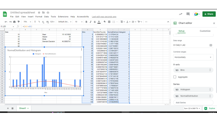
And there we are. One histogram and line distribution graph in Google Sheets.
Be sure to switch the series selection in the chart editor to your histogram and distribution.
How to Combine a Histogram and Curved Line in One Chart Using Microsoft Excel
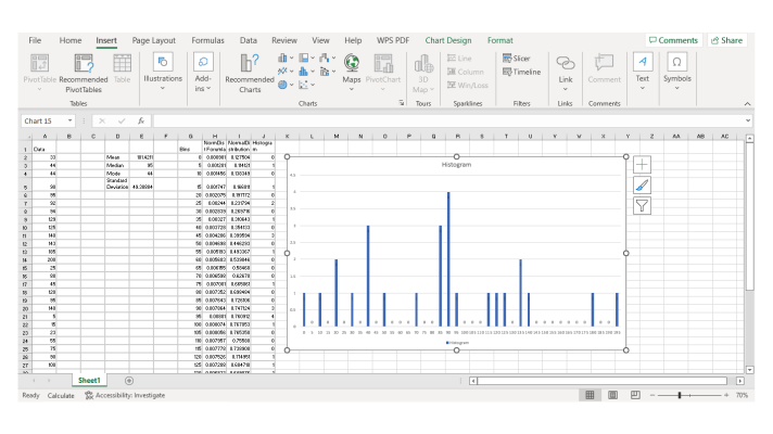
1. Insert Data and Create the Histogram
The process remains similar when working with excel.
Follow the steps to create the histogram that we did for Google Sheets.
Then create a histogram using that information where your bins constitute the X-Axis.
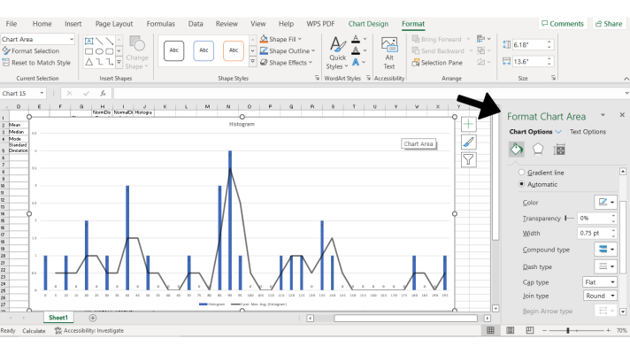
And from here, select your graph. In the top left, you will select Add Chart Element, then Trendline, and finally Moving Average.
From there, we can use the panel that appears on the right side of the screen to adjust our new trendline according to your preferences.
A Final Word
Now, this was a very elementary version of a combination histogram and line graph. And still, it took quite a bit of time, didn’t it? Imagine having to do this every time you wanted to update a chart or present new data. Thankfully, there’s an easy solution for all of your charting needs! Image Charts allows you present complex data in beautifully organized and informative charts of any type with just a couple of clicks of a button. And with Image Charts’ custom API, you can embed these customized charts anywhere that renders HTML. What’s more, you’re able to update these charts quickly, with the data auto-updating everywhere after a single change, so you never have to waste time checking if your data transferred correctly. That means you can use just a few clicks to tell the whole story behind your data. Check out Image Charts today for your next project to get the impact you want out of your data presentation with half the work. Set it up for free today in less than an hour, and generate unlimited perfect charts forever.


